Hit enter to search or ESC to close
Close Search
Starfish Creative StudioStarfish Creative StudioStarfish Creative StudioStarfish Creative StudioStarfish Creative StudioStarfish Creative Studio
  • Let’s Talk
Menu
  • UX in Action
  • About
  • My UX Process
  • Creative Archive
  • Let’s Talk

Sun Son

Description

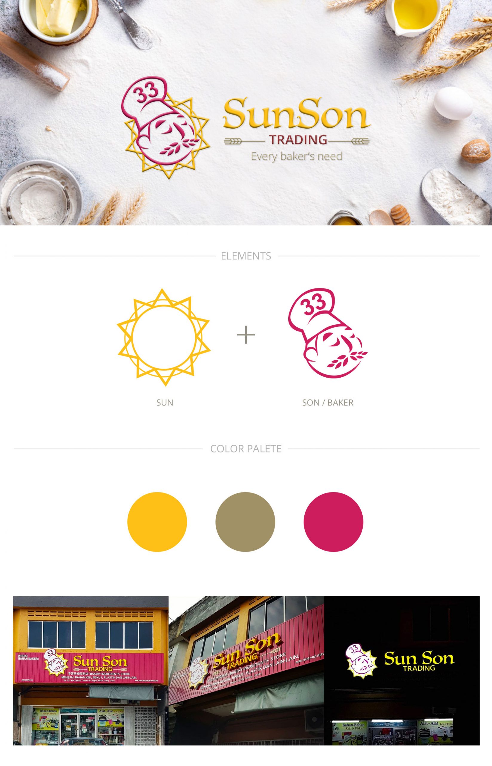
Sun Son Trading is a traditional bakery ingredient store, which is located in Kluang, Johor, Malaysia. With the rebranding, the idea of the logo design is using the element of bakery ingredient, like wheat; the company name, “Sun” (Sun) + “Son” (Human); and the English’s pronunciation of “Sun Son” , which is similar to “33” in pronunciation of Chinese .

It is using the die-cut acrylic signage with LED as finishing, which I would like to bring out the concept that Sun Son could illuminate the audience by the sunlight in the darkness as their company name.
All logo elements—the illustrations, typography, icons, and numbers

Client: Sun Son Trading
Designer: Starfish Lim Xin Yi

Explore More Work

AllBrandingGraphic DesignIllustrationKLIK+UXWeb Design🔓confidential
Illustration Style 2
Illustration Style 2Illustration

Illustration Style 2

Singapore Children’s Publishing House
Singapore Children’s Publishing HouseWeb Design

Singapore Children’s Publishing House

Tanexo
TanexoWeb Design

Tanexo

Share Share Share Pin

Available for Work

Get in Touch

LinkedIn

Instagram

© 2026. All rights reserved.
Close Menu
  • UX in Action
  • About
  • My UX Process
  • Creative Archive
error: Every piece here has a story. Look, enjoy, but let it stay home. 💫