Overview
KLIK+ Corp Pass Redesign
KLIK+ is a tenant management platform used within our building. Because our company is also a tenant, we extended the platform to include employee engagement features, such as the Corporate Pass system — where employees can redeem Attraction and Gym passes.
This project involved migrating a legacy Corp Pass system into the refreshed KLIK+ platform. My goal was to redesign the experience to be more clear, intuitive, and visually engaging, while addressing multiple passes and third-party booking limitations — all within a fast-moving, 2-week sprint.
My Role
UX Designer
What I Do
User Research, Interaction, Visual design
Team
Product Owner, DevOps, Operations
Date & Timeline
April 2025 (~ 2weeks)

Objectives
- Modernize the pass redemption experience
- Design a flexible layout that supports multiple passes
- Clarify the Gym Pass booking journey
- Work around limitations in third-party integration
- Test and validate with real internal users
Due to the tight timeline of this migration project, I leaned on a “Design Fast, Think Deep” mindset. This meant skipping lengthy formal research and instead applying focused competitive benchmarking, paired with rapid prototyping and validation.
Process 1
Legacy Audit
To ground my redesign, I audited the legacy flow and collected real user feedback.
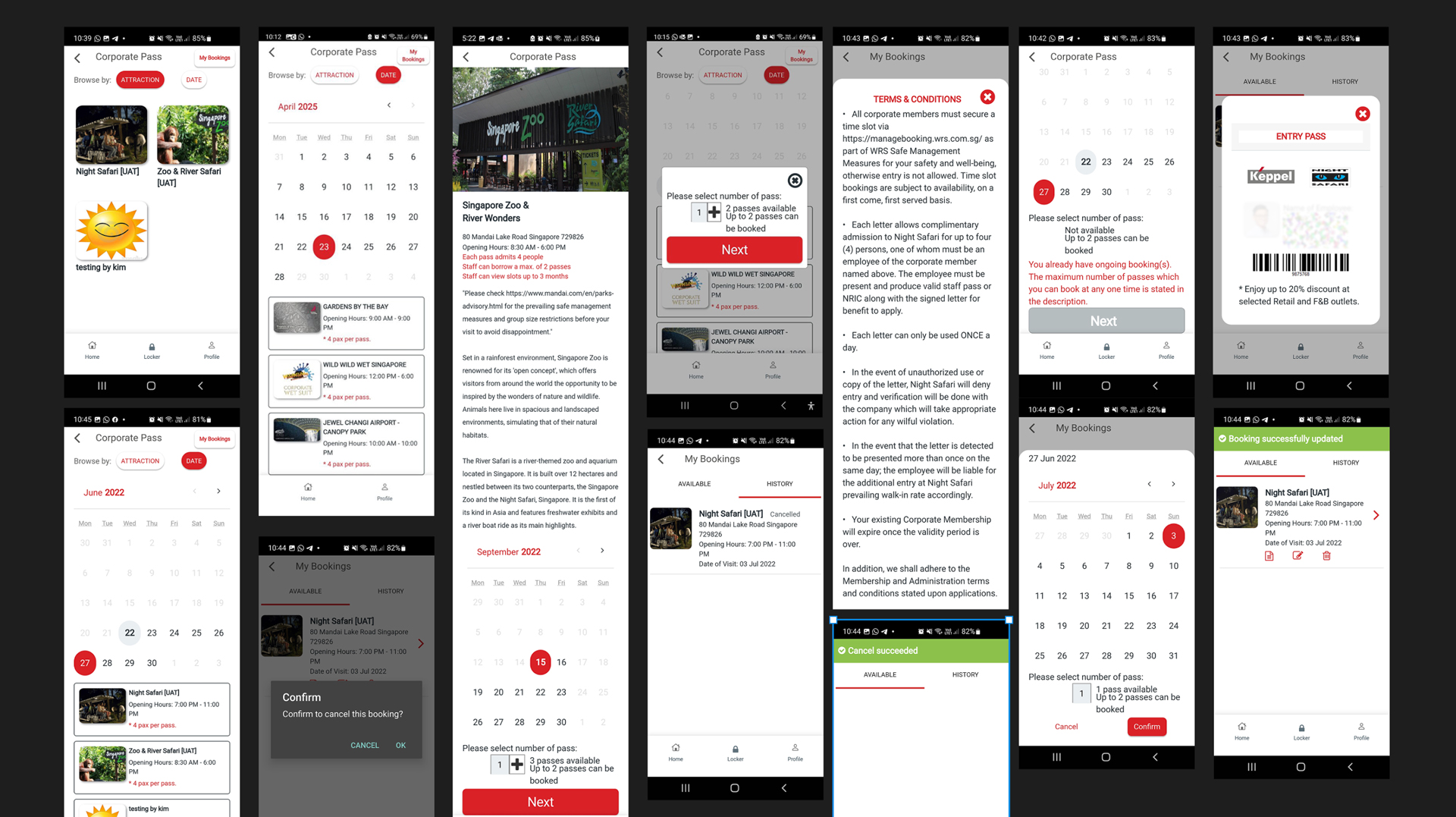
Issues Identified:
- No entry timing info → Users turned away at attractions like Jewel
- No expiry alerts → Users unknowingly used expired passes
- Ambiguous pass content → E.g., unclear if Gardens by the Bay included Flower Dome
- Overloaded text blocks → Key actions like calendar hidden below paragraphs
- Not optimized for accessibility → Users with larger fonts couldn’t see key buttons
- Poor discovery → Some users missed available passes entirely
- Slow download → No progress feedback led to user frustration
These issues highlighted a mismatch between user expectations and system behavior, guiding the redesign to prioritize clarity, visual hierarchy, and faster access to key actions.
Process 2
Competitive Analysis
Before jumping into design, I analyzed leading apps in the ticket and booking space to inform our flow:
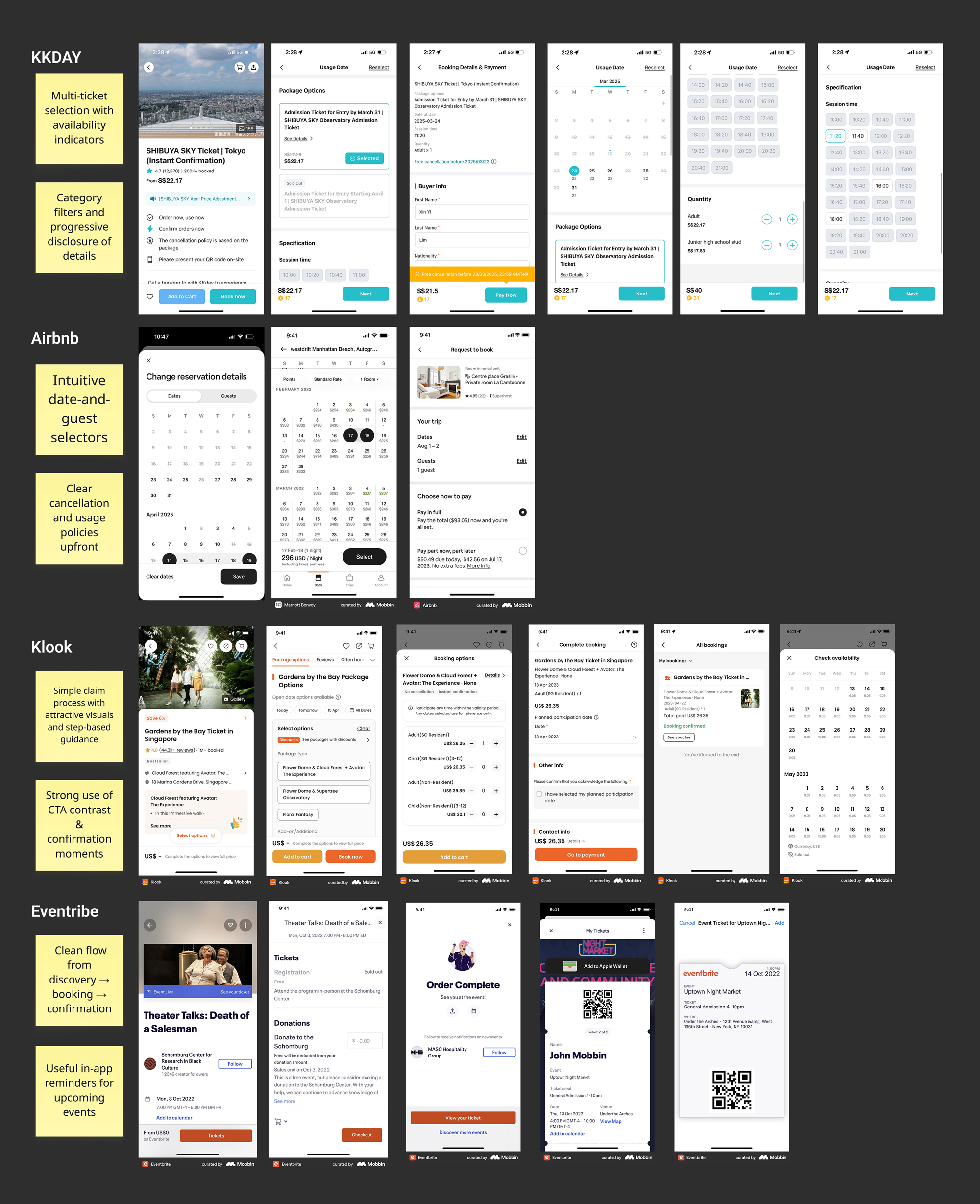
Key Takeaways:
- Use visual layouts for pass listings (cards, thumbnails)
- Break flow into bite-sized actions (Explore → Redeem → Confirm)
- Make handoffs to external systems feel trustworthy with clear copy
- Use micro-interactions to confirm success (e.g., toast messages, tooltips)
These insights directly informed how I structured pass discovery, separation, and the Gym booking workaround.
Process 3
Rapid Prototyping
Built hi-fi flows directly in Figma

Process 4
Lean Usability Testing + A/B Testing
Carousel vs Collapse for Multiple Passes
I tested both layouts during usability testing.

Option A: Collapse
Option B: Carousel
Common in local apps but users missed passes
Encouraged exploration and visual clarity
Stacked and text-heavy
Swipeable, lightweight, and card-style
✅ Decision: Proceeded with Option B – Carousel, even if unconventional locally, because users preferred its clarity and playfulness.
Process 5
Microcopy + Flow Refinement
Gym Pass Booking Flow (Workaround Done Right)
Constraint: Booking is handled externally via True Fitness — we couldn’t integrate the system.
Old Issue:
- Vague CTA: “Get Login”
- No context about why or what next
New Flow:
Get Class Booking Login → Show credentials → Redirect to site
✅ Improvements:
- Renamed CTA: “Get Class Booking Login”
- Added tooltip and toast notification
- Included 3-step booking instructions
- Displayed a note explaining the use of shared credentials”
Outcome
- Delivered fully functional prototype in 2 weeks
- Internal users completed tasks with less friction
- Carousel increased discoverability of multiple passes
- Workaround for Gym booking was understood and trusted
- Laid foundation for future features like QR passes and direct booking
Reflection
Design is Never Done
This was a fast-paced project that emphasized lean UX thinking, clear decision-making, and practical empathy. I’m proud to have made user-driven decisions that balanced business needs with real clarity and empathy.
But this isn’t the end — it’s just the start. The findings from this round have already opened doors for future improvements, and I see this as a foundation for ongoing iteration and discovery.